
Transforming a Blank Wall: Your Guide to a Beautiful DIY Rustic Sign
Hey there, fellow DIY enthusiasts and home decor lovers!
Hope you all had a wonderfully refreshing weekend. Mine was a delightful mix of family time and, let’s be honest, an epic battle with what felt like an endless mountain of laundry. Ashley and I often joke about how our perfectly folded laundry piles could easily pass for our latest intricate DIY projects – trust me, you’d be utterly impressed by the sheer dedication involved! But enough about domestic conquests, let’s dive into something truly creative for your home.
Discovering the Potential: A Blank Canvas Awaits
Every home has those spots, doesn’t it? Those unassuming areas that just scream for a touch of personality, a dash of flair, or perhaps a meaningful piece of decor to tie the whole room together. For me, that particular canvas has long been the expansive, rather uninspired stretch of wall situated perfectly between my kitchen and living room. It’s a lengthy, quiet space that, despite its prominent location, has remained stubbornly blank – catching my eye regularly and practically begging for an artistic intervention. I knew it deserved something special, something that would add warmth and character, transforming it from a mere passageway into a focal point. After much contemplation, the idea of a custom-made sign, brimming with rustic charm and personal touch, began to take shape.
This long, continuous stretch of wall, while functional, offered little in terms of visual interest. It’s a common dilemma in many open-plan homes, where defining spaces without adding physical barriers can be a design challenge. My goal was to introduce an element that would not only fill the void but also enhance the overall aesthetic of both adjoining rooms. A thoughtfully designed sign seemed like the perfect solution – something substantial enough to command attention, yet simple enough not to overwhelm the space. It needed to resonate with the existing decor while introducing a touch of personalized craftsmanship. The journey to create this bespoke piece began with carefully selected materials and a clear vision for a warm, inviting, and distinctly “shanty” aesthetic.
Crafting Stencils with Ease: The Power of Contact Paper
Now, let’s talk about stenciling. I’ll readily admit that freehand artistry isn’t exactly my strongest suit. While I admire those who can effortlessly create beautiful script or intricate designs by hand, I lean on reliable tools to achieve professional-looking results. For this project, the critical first step was creating crisp, clean stencils. My secret weapon? A roll of good old Contact Paper. This versatile material is not just for lining shelves; it’s an absolute game-changer for DIY stencils, especially when paired with a cutting machine.
If you’re lucky enough to own a Silhouette cutting machine, you’re in for a treat. This particular roll of Contact Paper has quickly become my new favorite material for stencils! I experimented with the settings, cutting it on the same vinyl setting, and the results were absolutely flawless. The blade glided through the paper cleanly, producing perfectly defined letters and shapes without any tearing or jagged edges. The beauty of Contact Paper lies in its adhesive backing, which ensures your stencil stays firmly in place while you paint, minimizing bleed-through and giving you sharp lines every time. For those without a Silhouette, fear not! You can still create custom stencils by printing your chosen design onto regular paper, adhering it to the Contact Paper, and carefully cutting it out with an X-Acto knife. It takes a little more patience, but the outcome is just as rewarding.
Selecting Your Canvas: The Perfect Wood Board
With the stencil material sorted, my next focus was the sign itself. I wanted a piece that felt substantial and authentic, providing a rustic foundation for my design. After a quick trip to Lowe’s (or your local home improvement store), I settled on a 1×10-foot board. Pine boards are generally excellent for this type of project due to their affordability and ease of working with. The ‘1×10’ refers to its dimensions, roughly 0.75 inches thick by 9.25 inches wide, and 10 feet long, giving me ample space to work with and allowing for a generous sign size. When selecting my board, I deliberately sought out one with character – complete with knots, minor imperfections, and a slightly rugged texture. This wasn’t about finding a pristine piece of wood; it was about embracing the natural beauty and imperfections that would contribute to that desirable “shanty” or distressed look I was aiming for. These natural flaws would later enhance the aged aesthetic, making the sign look like a cherished antique rather than a brand-new item.
Once I had my chosen board, the preparation began. I gave it a thorough cleaning to remove any dust or debris, then applied a couple of coats of Rust-Oleum Heirloom White paint. This particular shade offers a beautiful, soft, off-white finish that serves as an excellent base for a rustic piece. I allowed ample drying time between coats to ensure a smooth, even application and optimal adhesion. The goal was to create a clean, but not overly pristine, background that would allow the distressed letters to truly pop later on. This base layer is crucial as it dictates the underlying color that will peek through after the distressing process, adding depth and authenticity to the final product.
Precision Stenciling: Placing Your Letters Perfectly
Now for the exciting part: bringing the design to life on the board! After meticulously cutting my letters from the Contact Paper using my Silhouette, the next step was to carefully space them out on the wooden sign. This process requires a bit of an eye for symmetry and balance. Instead of guessing, I used the actual cut-out letter pieces themselves as my guide. By placing each letter individually onto the board, I could visually adjust their positions until they looked perfectly aligned and evenly spaced, ensuring a cohesive and professional appearance for the final sign. This method is incredibly effective for achieving a natural flow and proper kerning (spacing between letters) without needing complicated measuring tools.
Speaking of fonts, if you’re curious about the typeface I used, it’s a fantastic free font called Clarendon BT. I absolutely adore its classic yet slightly rustic feel, making it perfect for a project like this. Using a digital font and a cutting machine meant I didn’t have to rely on traditional cartridges, which not only saved me a significant amount of time but also a considerable sum of money. There are countless free fonts available online that can truly elevate your DIY projects, so don’t be afraid to explore and find one that speaks to your aesthetic!
Once I was satisfied with the letter placement, I then carefully positioned the outline piece of the stencil around each letter. This is where the magic of Contact Paper truly shines. Its gentle adhesive allows for repositioning if needed, but once pressed down, it creates a secure barrier. The key is to ensure all edges of the stencil are firmly pressed onto the wood, preventing any paint from bleeding underneath. I used a credit card or a craft squeegee to smooth out any air bubbles and ensure maximum adhesion, especially around the delicate edges of the letters. This step is crucial for achieving those crisp, professional-looking lines.
With the outlines firmly in place, the next satisfying step was to carefully peel off the inner letter pieces. This reveals the areas where the paint will be applied, leaving behind a perfectly shaped void for your chosen color. Take your time with this part, ensuring no small pieces of the stencil get accidentally pulled up. The adhesive strength of the Contact Paper is usually just right for this – strong enough to hold, but gentle enough to peel away without damaging the underlying paint finish. This technique creates a ‘reverse stencil’ effect, where the background color of the board forms the base of your letters, and you paint within the outline.
Bringing Color to Life: Painting Your Sign
Now, it was time to introduce some color! For the lettering, I reached for my favorite acrylic paint. Acrylics are fantastic for stencil projects because they dry relatively quickly, offer great coverage, and are easy to clean up. I chose a deep, rich hue that would provide a striking contrast against the Heirloom White base, ensuring the message stood out clearly while still maintaining that desired rustic aesthetic. When working with stencils, the type of paint can make a significant difference in the final outcome. Acrylic craft paints are often preferred due to their consistency, which isn’t too thin (preventing bleed) or too thick (allowing for smooth application).
The secret to successful stenciling lies in the application technique. Instead of brushing the paint on, which can force paint under the stencil edges, I used a dedicated stencil brush and a dabbing motion. Load your brush sparingly with paint, then offload any excess onto a paper towel. This ensures you have just enough paint to create an opaque layer without saturating the brush. Gently dab the paint straight down onto the exposed areas of the letters, building up the color in thin, even coats. This method significantly reduces the risk of paint bleeding under the stencil, giving you those clean, sharp lines we all strive for. Patience is key here; multiple thin coats are always better than one thick, heavy coat.
After carefully applying the paint to all the letters, the next crucial step is allowing it to dry completely. While acrylics dry quickly to the touch, it’s always best to give them ample time to cure fully, especially before attempting any distressing. Rushing this step can lead to smudging or uneven distressing. I usually let my projects dry overnight, or at least for several hours, to ensure the paint has thoroughly set. This guarantees that when you remove the stencil and begin the distressing process, the painted letters will remain intact and sharp, showcasing all your hard work. There’s nothing more satisfying than seeing your design come to life as the paint dries, ready for the next stage of transformation.
The Art of Distressing: Achieving that “Shanty” Look
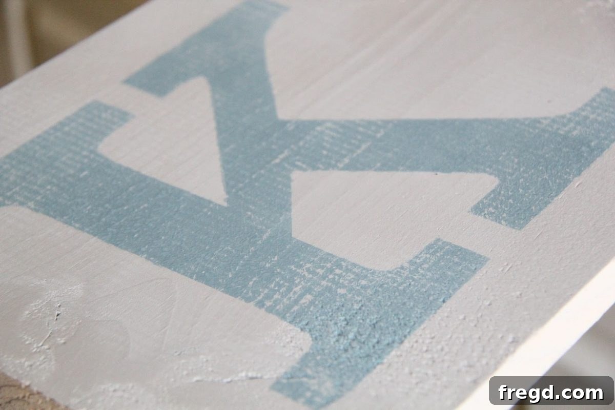
Once the paint was thoroughly dry and the stencils were carefully removed, I had a beautifully painted sign. But it wasn’t quite “me” yet. I wanted it to look like it had a story, a history – something aged and full of character, rather than fresh off the craft table. This is where the magic of distressing comes in! While my husband still ponders why anyone would intentionally make something new look old, I absolutely adore the depth and authenticity it adds to a piece. It’s about creating visual texture and softening the edges of a perfect finish, giving it that beloved vintage or farmhouse aesthetic. A lightly distressed finish allows the beautiful base color to peek through, adding layers of visual interest.
To achieve this coveted aged appearance, I grabbed a 3M 220-grit sanding block. This fine-grit sandpaper is perfect for gentle distressing; it removes just enough paint to reveal the underlying wood or base coat without being too aggressive. My technique involved lightly sanding over the painted letters. The goal isn’t to obliterate the design but to softly wear down the edges and high points, mimicking years of natural wear and tear. I focused on areas that would naturally see the most friction, such as the corners and edges of the letters. The result was exactly what I envisioned – a wonderfully faded, slightly chipped effect that made the sign feel instantly older and more charming. I truly LOVE the result; it transformed a clean sign into a piece with soul and character.
This careful sanding creates subtle variations in color and texture, adding depth that a flat, un-distressed finish simply can’t achieve. It’s about imperfection, embracing the beauty of a well-loved item. Every stroke of the sanding block contributes to a unique narrative for your sign, ensuring no two distressed pieces are ever exactly alike. This technique is incredibly versatile and can be applied to various DIY projects, from furniture makeovers to smaller decorative accents, always bringing that coveted vintage charm.
Beyond just the letters, I also spent some time lightly distressing the edges of the board itself. This involves carefully rubbing the sanding block along the perimeter, especially on the corners, to soften any sharp lines and create further visual wear. The aim is to make the entire piece look cohesive, as if it has naturally aged over time. This extra step truly elevates the rustic appeal, ensuring the sign looks genuinely vintage rather than a newly made item attempting to look old. The subtle imperfections on the board, chosen earlier, now blend seamlessly with the distressed paint, completing the authentic “shanty” transformation.
Final Touches and Anticipation
With the distressing complete, my beautiful new sign is almost ready for its permanent home. The final step in this stage of the project is to apply a protective topcoat (which I’ll detail more in a future post, alongside the installation) to seal in all that hard work and ensure its longevity. Then, this charming piece will be mounted on the wall, finally bringing character and warmth to that once-blank space between my kitchen and living room. I can’t wait to show you all the finished display in my next post, where we’ll cover hanging techniques and how it integrates into the overall room decor. This project has been incredibly rewarding, proving that a little creativity and effort can transform an overlooked area into a beloved feature.
Thanks so much for stopping by and following along with this DIY adventure! I hope this detailed guide inspires you to tackle your own blank spaces and infuse them with personality. Whether it’s a small accent or a large statement piece, handmade decor adds unparalleled charm to any home. Now, if you’ll excuse me, I hear the siren call of the laundry room once more – some battles never truly end! 😉
Happy crafting!
~Whitney