
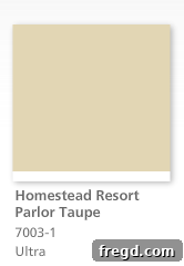
Transform Your Home with the Perfect Neutral: Discovering Valspar Homestead Resort Parlor Taupe
Hey friends and fellow home enthusiasts!
There’s nothing quite as satisfying as refreshing your living space, and right now, I’m knee-deep in an exciting bedroom revamp project. The anticipation is almost palpable, and I truly can’t wait to share all the details and transformations with you soon! As part of this renovation, tomorrow marks a significant milestone: tackling the wall paint. This essential step always sets the tone for the entire room, and it’s one I approach with careful consideration.
Over the years, one question consistently pops up in my inbox and comments: “What wall colors do you use?” It’s a query that warms my heart because it means you’re just as passionate about creating beautiful, cohesive spaces as I am. Given my upcoming painting day, I realized this is the absolute perfect moment to pull back the curtain and reveal the secret behind the beautifully balanced, inviting atmosphere throughout my home.
I’m thrilled to announce that for my bedroom, I’ll be embracing the same incredible shade I’ve used in so many other areas of my house. This color isn’t just a paint choice; it’s a foundational element that brings harmony and elegance to every room it graces. It’s a color I genuinely adore, and for good reason—it epitomizes the ideal neutral. It strikes a remarkable balance, incorporating just the right touch of sophisticated gray, a hint of comforting cream, and a whisper of crisp white. This intricate blend makes it incredibly versatile, allowing it to seamlessly complement virtually any decor style, furniture piece, or accent color you can imagine.
The star of today’s show, the neutral champion that has captured my heart and transformed my home, is a Valspar color known as Homestead Resort Parlor Taupe. This name itself evokes a sense of timeless elegance and cozy luxury, perfectly reflecting the paint’s character. It’s a shade that doesn’t just cover your walls; it envelops your space in warmth and sophistication, creating a backdrop that is both subtle and impactful.
Understanding the Nuances of Neutral Paint Colors
Choosing the right neutral paint color is perhaps one of the most crucial decisions you can make when decorating your home. A well-selected neutral provides a canvas that enhances everything else in the room, from furniture to artwork, without competing for attention. Homestead Resort Parlor Taupe excels in this role. Its unique composition of gray, cream, and white undertones means it adapts beautifully to different lighting conditions throughout the day. In morning light, you might notice more of its creamy warmth; by afternoon, the subtle gray notes might become more prominent; and under artificial evening light, it maintains a soft, inviting glow.
This adaptability is key to its success. It avoids the common pitfall of some grays that can feel cold or some creams that can appear too yellow. Instead, it offers a sophisticated warmth that is neither too dark nor too light, making rooms feel spacious and welcoming simultaneously. It’s the kind of color that makes you feel instantly at ease the moment you step into a room.
Seeing is Believing: Homestead Resort Parlor Taupe in Action
I completely understand the frustration of trying to pick out paint colors from a computer screen. Paint chips, especially online, can be incredibly deceiving due to variations in monitor calibration and screen settings. What looks perfect on one screen might appear completely different on another, and nothing truly compares to seeing a color in your own home’s light. That’s why, instead of relying solely on a digital swatch, I’m excited to show you this gorgeous color in real-life settings. Here are a few glimpses of Homestead Resort Parlor Taupe bringing life and character to various spaces throughout my house, providing a much clearer and more authentic representation of its beauty.
A Welcoming Entryway with Neutral Charm
Let’s begin with my entryway! This high-traffic area is the first impression visitors get of our home, and it needs to be both inviting and practical. Homestead Resort Parlor Taupe creates a warm, understated welcome, immediately setting a serene tone. It perfectly complements the rustic elegance of my DIY bench, a piece that adds both seating and character. The neutral backdrop also allows the intricate details of my DIY hook shelf to truly pop, offering a functional yet stylish spot for coats and bags. The paint helps to visually expand the space, making the entryway feel open and airy, rather than cramped. It’s a testament to how a well-chosen neutral can make a small area feel grander and more cohesive.
Living Room Serenity: A Backdrop for Love
Moving further into the heart of our home, you’ll find our living room also adorned in this beautiful neutral. This is a space where we gather as a family, relax, and entertain, so comfort and style are paramount. Homestead Resort Parlor Taupe creates a wonderfully serene and sophisticated backdrop for our everyday lives. It truly shines behind my DIY LOVE sign, allowing the artistic piece to stand out prominently without any visual clutter. The paint color helps to define the architectural features of the room, providing depth and warmth without overpowering the furniture or decorative accents. It makes the room feel both cozy and expansive, proving its versatility in spaces of varying sizes and functions. It’s truly a shade that fosters a sense of calm and togetherness.
Sweet Dreams and Creativity in the Girls’ Room
The versatility of this taupe extends even to the children’s spaces. My oldest girls’ room also features this exquisite wall color, creating a sophisticated yet playful environment that can grow with them. It provides a grounding base for their vibrant personalities and evolving tastes in decor. Here, it beautifully frames the custom desk I crafted for them from old barstools, highlighting the craftsmanship and adding a touch of personalized charm. The neutral walls ensure that their colorful toys, bedding, and artwork can take center stage without making the room feel chaotic or overwhelming. It’s a smart choice for shared spaces, offering a calming influence and a harmonious foundation for individual expression.
Dynamic Design in the Oldest Son’s Room
And for my oldest son’s room, I took a slightly different approach, demonstrating another facet of Homestead Resort Parlor Taupe’s adaptability. Here, it graces the upper portion of the walls, creating a clean, structured line with a contrasting trim below. I absolutely adore how effortlessly it blends with the cool blue tones I chose for the lower half, creating a masculine yet soothing palette. This technique of splitting the wall with paint and trim adds architectural interest and allows for creative color blocking. It serves as a fantastic backdrop for the Restoration Hardware-inspired desk I made him, emphasizing its sturdy design. Furthermore, it highlights his practical and stylish $20 picture ledges, which are perfect for displaying books, art, and cherished memorabilia. This room truly shows how Homestead Resort Parlor Taupe can be integrated into more dynamic design schemes, proving it’s far from just a “plain” neutral.
The Perfect Companion: Valspar Ivory Lace Trim
No discussion about wall color is complete without acknowledging its perfect partner: the trim paint! I genuinely believe these two colors are a match made in heaven – or, more accurately, a perfect pairing discovered at Lowe’s. The trim paint, another exceptional Valspar shade, is called Ivory Lace. It’s not a stark, brilliant white, but rather a perfect off-white with a subtle softness that prevents it from feeling cold or clinical. Its gentle warmth beautifully complements Homestead Resort Parlor Taupe, providing a crisp yet harmonious contrast that defines architectural details without being jarring. Ivory Lace adds that final touch of polished elegance, allowing the wall color to truly sing while maintaining a cohesive and inviting aesthetic throughout the home. Together, they create a timeless and sophisticated foundation for any interior design.
Tips for Choosing Your Own Perfect Neutral Paint Color
Inspired to find your own perfect neutral? Here are a few tips to help you in your paint journey:
- Test, Test, Test: Always buy sample pots and paint large swatches on your walls. Observe them throughout the day in different lighting conditions.
- Consider Undertones: Pay attention to the subtle hints of color (red, yellow, blue, green) within your chosen neutral, and how they interact with your existing furniture and decor.
- Look at the Bigger Picture: Think about how the color flows from one room to another, especially if you’re using a single neutral throughout your home.
- Don’t Forget the Finish: The sheen (matte, eggshell, satin) can significantly alter how a color appears and its durability. Eggshell or satin are great for living areas for easy cleaning.
- Match with Trim: Just as I paired Homestead Resort Parlor Taupe with Ivory Lace, consider how your wall color will interact with your trim for a complete look.
What’s Next? My Bedroom Reveal!
Well, friends, that’s my deeply cherished secret for creating a warm, inviting, and versatile home palette. I hope sharing my favorite Valspar hues, Homestead Resort Parlor Taupe and Ivory Lace, has provided you with some inspiration for your own projects. For now, it’s back to work for me! My bedroom isn’t going to revamp itself, and I’ve got plenty more exciting changes to implement. I’m particularly thrilled about the new desk I built – yes, the very one I’m currently sitting at to type this! Consider that a little teaser for what’s to come. 😉
Thank you for joining me on this color journey. I will definitely be back very soon to share more updates on the bedroom makeover, including that fabulous new desk and much more. Until then, have a wonderful evening and happy decorating!
~Whitney