
Transforming Our Home: A Deep Dive into Our Valspar Paint Color Selections
Hello, fellow home enthusiasts! I’m thrilled to be back with another exciting update on our house renovation journey, and this time, we’re diving headfirst into the vibrant world of paint color choices! This stage of the project has been particularly enjoyable because, unlike structural changes, paint is a commitment that offers the refreshing flexibility of change. For those of you who follow our adventures on Instagram, you might have already caught a glimpse or two of the stunning transformations unfolding in some of our rooms. Selecting the perfect palette for an entire home, both inside and out, is undeniably one of the toughest decisions homeowners face. It would have been incredibly helpful to see real-life room images of every single paint option I considered, so in the spirit of helping all of you navigating the often-overwhelming paint aisles, I’m excited to share my carefully curated selections and the reasoning behind them.
Our quest for the ideal colors led us straight to Lowe’s, where we ultimately decided on Valspar paints for every surface, from our cozy interiors to our home’s resilient exterior. For the interior spaces, after much consideration, I opted for Valspar Signature, renowned for its excellent coverage and integrated paint and primer in one formula. This feature is an absolute game-changer, saving significant time and effort while ensuring a beautifully uniform finish. We chose a satin sheen for the interior walls, a practical decision driven by the lively dynamics of our household. With two energetic teenage boys and an inquisitive toddler, durability and easy cleanability were paramount. The satin finish provides a subtle, sophisticated luster that’s also incredibly resilient and simple to wipe clean, standing up perfectly to everyday spills and scuffs.
When it came to the exterior of our home, the demands shifted towards extreme durability and weather resistance. Valspar Duramax was our clear choice here, again boasting a paint and primer in one formula, which streamlines the painting process and offers superior protection against the elements. For the exterior sheen, we selected eggshell. This finish strikes a perfect balance, offering a soft, low-sheen appearance that helps conceal minor surface imperfections while still providing excellent cleanability and robust protection against fading, cracking, and peeling. Making these foundational choices set the stage for the exciting color selections that would truly bring our vision to life.
Interior Elegance: Our Chosen Valspar Hues
Fairmont Penthouse Stone: The Perfect Greige Neutral
One of the most crucial decisions was selecting a core neutral that would flow seamlessly through the majority of our home’s common areas. We wanted a shade that was versatile, welcoming, and didn’t feel cold or stark. After countless swatches, we landed on Valspar Fairmont Penthouse Stone, a truly exquisite “greige” that embodies the best qualities of both grey and beige. This yummy neutral will grace all the rooms in our house, with the exception of the individual bedrooms, creating a cohesive and sophisticated backdrop for our decor. What makes Fairmont Penthouse Stone so remarkable is its incredible ability to impart a warm, inviting feeling without darkening a room. It adapts beautifully to varying light conditions, appearing subtly different throughout the day, always maintaining its elegant and serene character. It serves as an ideal canvas, allowing furniture, art, and personal touches to truly shine without competing for attention.
To further illustrate its beauty, here’s another detailed shot of Fairmont Penthouse Stone gracing our entry. Notice how it welcomes you into the home, providing a sense of calm and continuity. Its subtle undertones allow it to pair effortlessly with a wide range of accent colors and wood tones, making it an incredibly flexible choice for open-concept living. This color truly defines the foundational aesthetic of our home, offering both understated elegance and practical versatility for family life.
Seine: A Deep, Beloved Statement Color
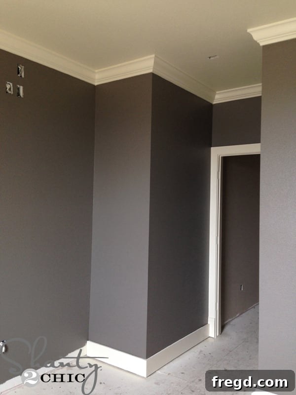
Now, let’s talk about one of my absolute FAVORITE choices: Valspar Seine! This color captured my heart so completely that it found its way into multiple rooms throughout our home. Its rich, deep hue creates an incredibly cozy and sophisticated atmosphere. We’ve used Seine in one of our boys’ bedrooms, where it provides a grounding and mature feel that will grow with them through their teenage years. It’s a color that evokes a sense of calm and depth, perfect for creating a personal sanctuary.
Not only did Seine make it into a boys’ room, but it also became the defining color of our master bedroom, creating a truly luxurious and enveloping retreat. Its allure was so strong that even my husband, the “hubs,” was drawn to it, selecting it for his study to create a sophisticated and focused workspace. Given its darker, more saturated nature, we strategically paired Seine with a lighter color for the ceilings. We opted for Valspar Ivory Lace on the ceilings, a soft, creamy white that offers a beautiful contrast, ensuring the rooms still feel expansive and bright, rather than enclosed. To maintain this elegant continuity, we also had all our oil-based trim paint custom-tinted to perfectly match Ivory Lace, providing a crisp, clean line against the deep Seine walls and tying the entire room together with exquisite detail. This careful combination highlights the depth of Seine while preventing the space from feeling too heavy, creating a harmonious and balanced design.
Coastal Villa: A Bright Exterior Complement
Transitioning to our home’s exterior, the powerful impact of color combinations continues. We utilized Seine on the exterior as well, specifically to trim our roof line and around our windows, providing a cohesive link to the interior palette and a striking contrast against our primary exterior siding color. The lighter color you see in this photograph, particularly on the staggered-edge siding, is Valspar Coastal Villa. This beautiful, airy shade serves as a fantastic complement to the deeper Seine, creating a balanced and visually appealing facade. Coastal Villa brings a fresh, bright element to the home’s exterior, enhancing its curb appeal and making the darker trim truly pop. This thoughtful combination of light and dark ensures our home stands out with refined elegance while maintaining a welcoming atmosphere.
Rugged Suede: A Sophisticated Choice for a Teenage Boy
For our other son’s bedroom, we explored a slightly different, yet equally sophisticated, dark hue: Valspar Rugged Suede. On the walls, once applied, it surprisingly ended up looking quite similar to Seine, offering that desired depth and maturity. However, Rugged Suede possesses a distinct character; it carries more of a subtle navy and smokey undertone, giving it a slightly different dimension compared to Seine’s deeper blue-grey. This rich, muted shade is an absolutely fantastic color for a teenage boy’s room. It’s masculine without being overly stark, provides a great backdrop for various decor styles, and is practical enough to withstand the daily life of an active teen. The smokey quality adds an intriguing layer, making the room feel both contemporary and timeless.
Blue Whisper: A Serene Escape for Our Daughter
Finally, for our daughter’s room, we sought a color that was both cheerful and calming, creating a perfect sanctuary for her. Our selection, Valspar Blue Whisper, is everything I envisioned and more – I absolutely LOVE it! This soft, ethereal blue embodies tranquility and innocence, making the room feel bright, airy, and utterly enchanting. It’s a shade that promotes relaxation and creativity, perfect for a young girl’s space where dreams are born and imagination flourishes. Blue Whisper provides a gentle and inviting atmosphere, making the room a true haven that she adores spending time in.
Beyond the Colors: Practical Tips for Your Paint Project
Choosing paint colors is just one step in the journey. Here are some invaluable tips gathered from our experience to help you with your next painting project:
- Test, Test, Test: Always paint large swatches on your walls and observe them throughout the day in different lighting conditions. Natural and artificial light can drastically alter how a color appears.
- Consider Sheen: The finish matters! Matte or flat paints hide imperfections but are harder to clean. Eggshell and satin offer a good balance of durability and subtle luster. Semi-gloss or high-gloss are best for trim, doors, and areas requiring high durability and easy cleaning.
- Flow and Continuity: Think about how colors transition from one room to another, especially in open-concept layouts. A cohesive palette creates a harmonious feel throughout your home.
- Trim and Ceiling Colors: Don’t forget these essential elements! Often, a crisp white or a complementary light neutral on ceilings and trim can make your wall colors pop and define the architectural features of a room.
- Primer Power: While paint and primer in one products are excellent, for drastic color changes or problematic surfaces, a dedicated primer can be a lifesaver, ensuring true color rendition and optimal adhesion.
- Budget Wisely: Invest in quality paint. It often provides better coverage, durability, and a more professional finish, saving you time and money in the long run.
Looking Ahead: More Updates to Come!
That’s a wrap on our current paint color revelations! Things are moving along at an incredible pace here, and the house is truly starting to feel like home, thanks in large part to these carefully chosen hues. I already have so much more to share with you all very soon, from decorating details to other exciting renovation progress. Each decision, big or small, brings us closer to our dream home, and sharing this journey with you makes it all the more rewarding. Thank you immensely for stopping by and following along with our home transformation adventure. Your support and interest mean the world to us!
~Ashley