
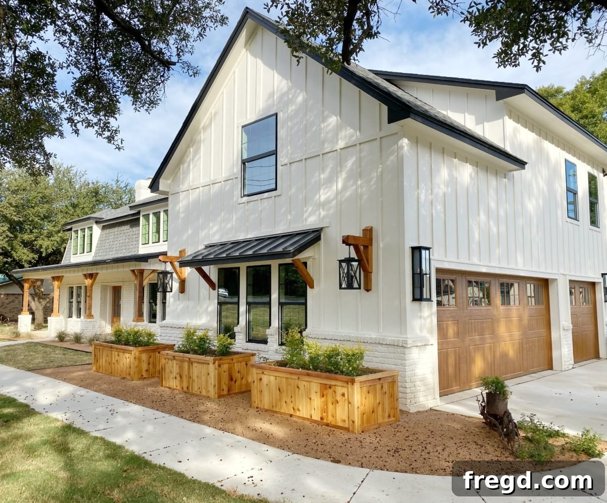
Hey there, fellow home design enthusiasts and renovation adventurers! We are absolutely thrilled you’re following along on our exciting flip house journey. The finish line is now firmly in sight, and we’re just a few short weeks away from unveiling the breathtaking final reveal. The anticipation is almost unbearable!
Just look at her! Isn’t she beautiful? And yes, did we mention she’s ALMOST DONE? We couldn’t be more excited to share the transformation with you!
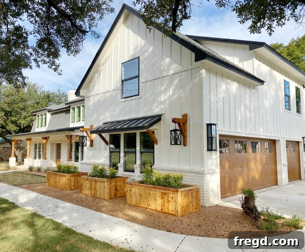
One of the questions we get asked most frequently about this flip house project revolves around our paint color selections. It seems picking the perfect paint can be as daunting as naming a newborn – a truly challenging, yet crucial decision! To simplify things for everyone, we’ve gathered all the details on our chosen colors and finishes right here in one comprehensive guide.
For this flip house, we were delighted to partner with one of our all-time favorite brands for paint: Sherwin-Williams. Their exceptional quality, extensive color palette, and reliable performance have made them our go-to choice for many years, and there was no doubt they were the perfect fit for bringing our vision for this home to life. Let’s dive into the interior paint selections first, where every shade was chosen to create a serene and inviting atmosphere.

Interior Paint Palette: A Foundation of Serenity and Style
Embracing Pure White SW7005: The Timeless Canvas
Our primary goal for the interior was to establish a very neutral, clean background that would allow other design elements to shine, creating a sense of spaciousness and modern elegance. For this, we opted for one of our absolute favorite whites: Pure White SW7005. This particular white is incredibly versatile, offering a crisp yet warm feel without any stark blue undertones, making it the ideal choice for a welcoming home environment.
For the walls throughout the main living areas, we utilized Sherwin-Williams’ Cashmere acrylic latex paint. We know what you might be thinking – a flat finish sounds intimidating and difficult to maintain. However, with Cashmere, this couldn’t be further from the truth. This specific product delivers a beautifully soft, luxurious finish with just the slightest hint of a subtle sheen, making it surprisingly durable and remarkably easy to clean. We loved it so much that we even applied the same Pure White paint and finish in our own dining room just a few months ago, and we are absolutely enamored with the results.
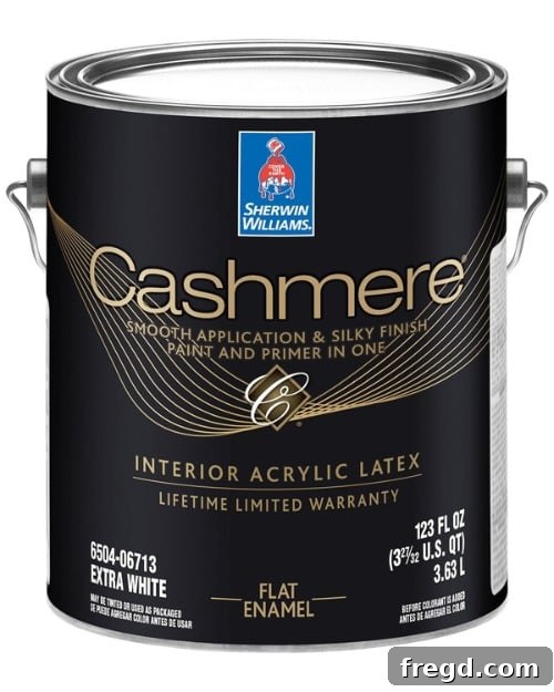
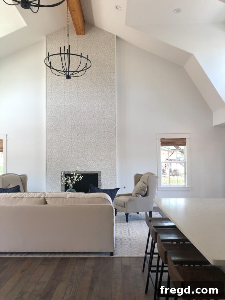
Continuing the cohesive flow, Pure White was also applied to all the interior trim, doors, and baseboards. For these high-traffic areas, we opted for an enamel paint for its superior durability and smooth finish. We’ve personally experimented with both oil-based and acrylic latex enamel paints for trim in our own home, and both perform exceptionally well. While acrylic latex offers easier cleanup, oil-based paint does tend to offer a slight edge in resisting wear and tear over time. Furthermore, oil-based enamel sprays on incredibly smoothly, making it our painter’s first choice for achieving that flawless, professional look on trim.
Introducing Dorian Gray SW7017: Sophistication in the Kitchen and Bathrooms
In the heart of the home, the kitchen, we wanted to introduce a subtle contrast while maintaining a warm and inviting atmosphere. For the cabinetry, we selected an enamel paint in the exquisite color Dorian Gray SW7017. This shade is truly the epitome of a perfect gray if you’re seeking a color with just the right hint of warmth. Unlike many grays that can lean towards a blue undertone, especially when paired with warmer whites, Dorian Gray maintains its sophisticated warmth, creating a harmonious balance. We absolutely adore how it complements the Pure White walls and the various wood tones thoughtfully integrated throughout this space, adding depth and character without feeling heavy.
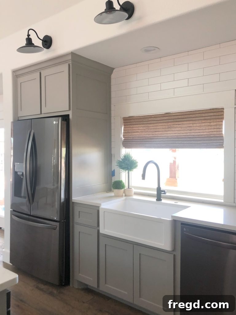
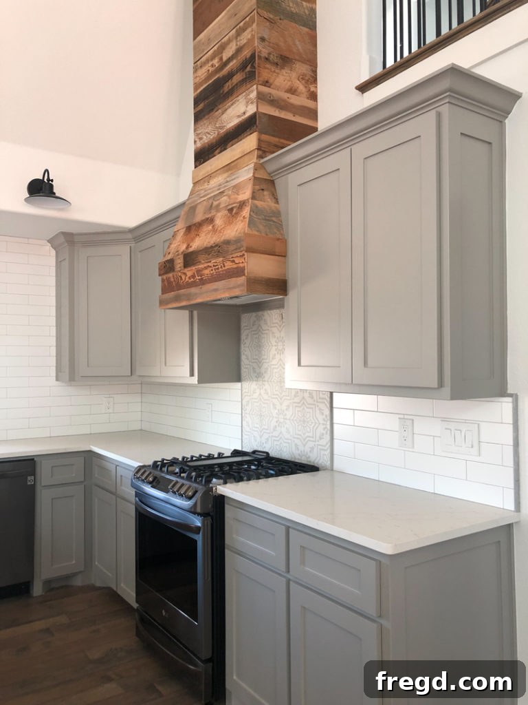
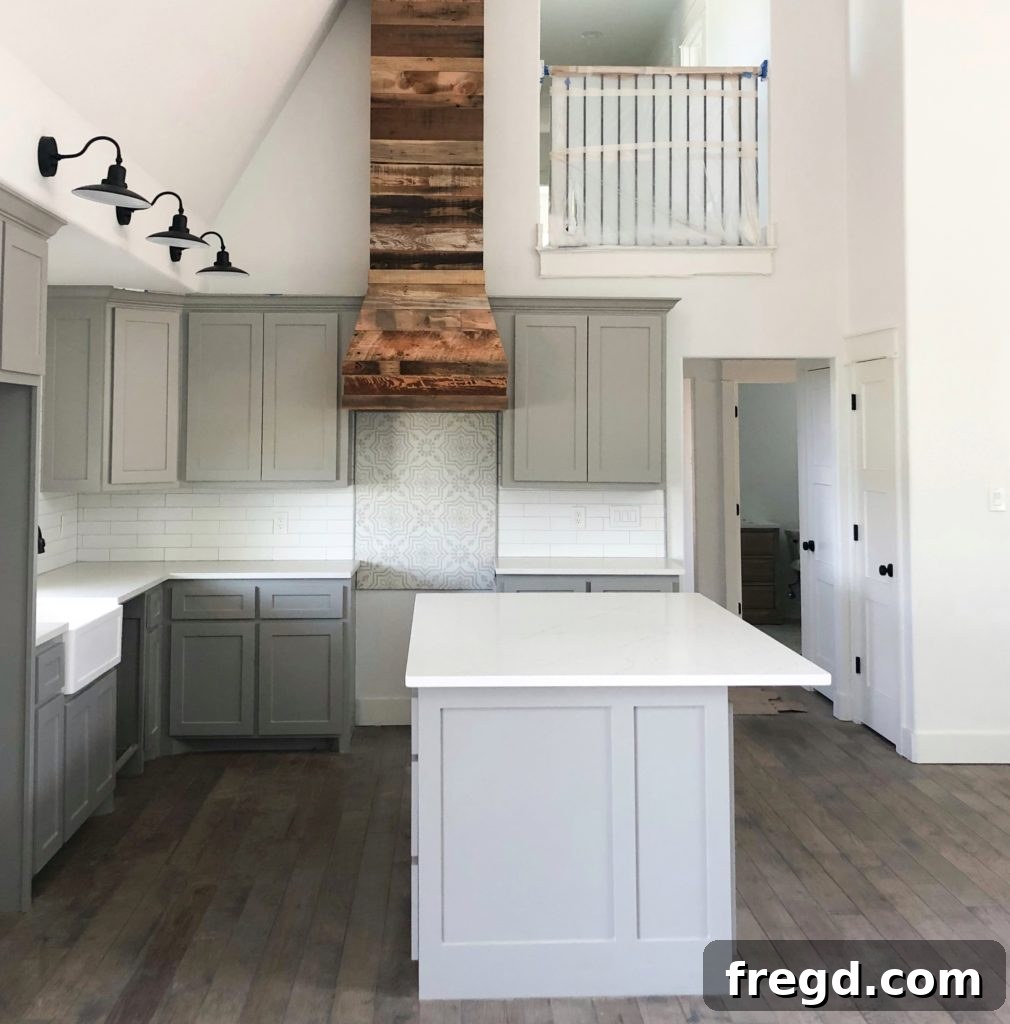
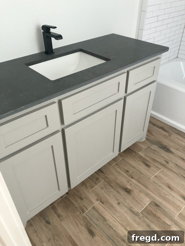
The versatility of Dorian Gray extends beyond the kitchen. We carried this same elegant color into two of the upstairs bathrooms, where it truly shines against the beautiful faux wood tile floors. The warm gray creates a lovely contrast that enhances the natural aesthetic of the tiles. Furthermore, the combination of Dorian Gray with the dark gray quartz countertops in these bathrooms is, in a word, perfection. The softer gray cabinetry beautifully highlights the depth of the darker counters, creating a cohesive and luxurious feel.
Master Bath and Laundry Room: Bright and Functional
For the master bathroom and the laundry room, our design philosophy shifted slightly to maximize light and a sense of freshness. Here, we chose to use Pure White on the cabinets as well, again utilizing the durable enamel paint. The “white on white” aesthetic, thoughtfully paired with darker countertops and carefully selected tile mixes, came together flawlessly to create spaces that feel both incredibly light and bright, yet still inherently welcoming and functional.
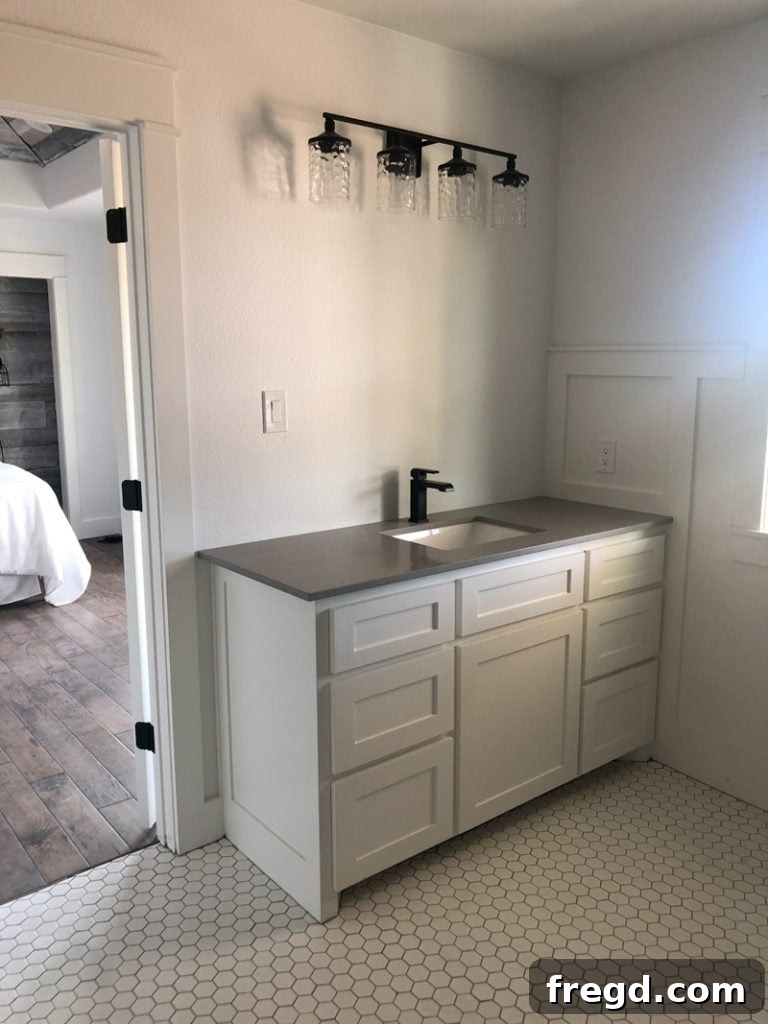
The overarching theme for the interior of this flip house revolves around a harmonious blend of whites and grays. Despite this neutral palette, the careful selection of undertones and finishes ensures that the entire home feels wonderfully warm and cozy – precisely the inviting atmosphere we aimed to achieve for its future owners.
Exterior Transformation: Elevating Curb Appeal with Sherwin-Williams
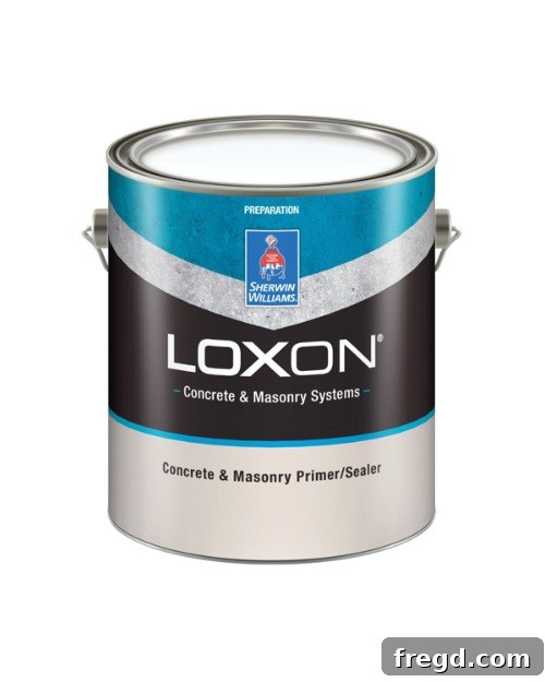
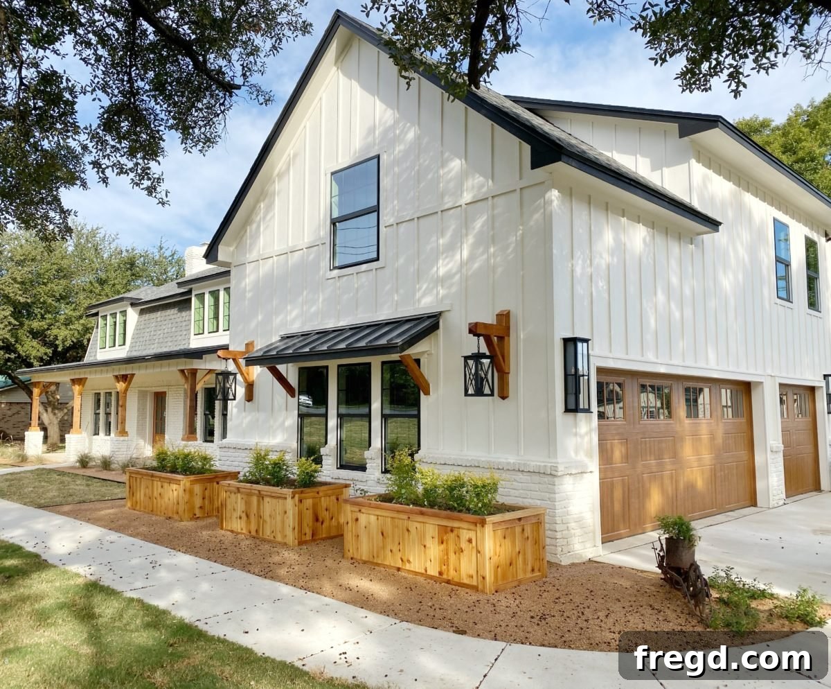
Now, let’s venture outside and talk about the exterior – a true testament to transformation! We honestly couldn’t be happier with the incredible curb appeal we managed to achieve. One of the primary design challenges we encountered was ensuring the existing brick exterior seamlessly integrated with the newly added board and batten siding. Our solution, decided early in the process, was to paint the brick, thereby unifying the different textures and materials into a cohesive, modern facade. Before applying any topcoat, proper surface preparation is paramount. For this crucial step, we used Sherwin-Williams’ Loxon Concrete and Masonry Primer and Sealer, ensuring optimal adhesion and a long-lasting finish.
Dover White SW6385: A Welcoming Exterior Glow
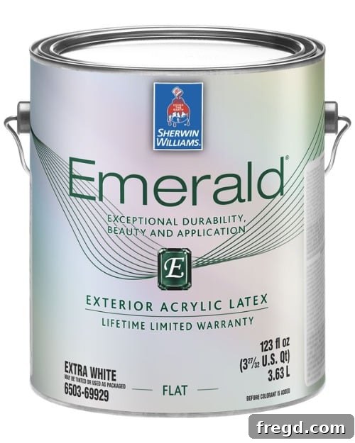
For the main body of the house, including the newly painted brick and board and batten, our topcoat choice was Dover White SW6385. While it photographs beautifully, we truly believe this white appears even more stunning and vibrant in person. Our vision was a warm white that wouldn’t feel too stark against our chosen trim color, and one that would gracefully harmonize with the natural cedar accents we incorporated. Dover White absolutely hit the nail on the head, providing a soft, inviting warmth that truly elevated the home’s exterior. The product we used for this was Sherwin-Williams’ Emerald Exterior Acrylic Latex, which applied incredibly thick and delivered fantastic coverage. We opted for a satin finish, which offers a subtle sheen that is both elegant and durable.
Tricorn Black SW6258: Bold Contrasts and Modern Edge
To provide a striking contrast and define the architectural features of the home, we selected Tricorn Black SW6258 for all the exterior trim. This deep, true black creates a powerful visual statement against the warm Dover White, instantly adding a modern and sophisticated edge to the facade. The contrast is simply stunning and perfectly complements the natural warmth of the cedar accents. For consistency and superior performance, the paint product used on the trim was also Sherwin-Williams Emerald Exterior Acrylic Latex, ensuring excellent durability and weather resistance, just like the paint used on the brick and siding.
Tips for Choosing Your Perfect Paint Colors
Inspired by our journey? Selecting paint colors can be overwhelming, but with a few tips, you can confidently choose shades that transform your home:
- Consider the Lighting: Paint colors look different under natural sunlight, warm incandescent bulbs, or cool LED lights. Observe samples at different times of day to see how the color truly behaves.
- Test, Test, Test: Don’t skip the sample pots! Paint large swatches on several walls in the room, or on movable boards, to truly understand how the color interacts with your space.
- Think About Existing Elements: Your flooring, furniture, and fixed features (like countertops) are part of your color palette. Choose colors that harmonize or provide a pleasing contrast with these elements.
- Embrace Neutrals: Neutrals like whites, grays, and beiges offer versatility and a timeless base, allowing you to easily update decor and accessories without repainting.
- Understand Undertones: Every color has an undertone (warm, cool, green, blue, pink, etc.). Knowing this helps you avoid clashes and achieve the desired mood.
- Consult Experts: Don’t hesitate to leverage resources like Sherwin-Williams’ color consultants or online tools for guidance and inspiration.
Final Thoughts on Our Flip House Paint Journey
So, what do you think of our paint selections and the incredible transformation they’ve brought to this flip house? We are absolutely loving how everything is coming together, from the serene interior to the striking exterior, and we simply cannot wait to share the grand reveal with you over the next few weeks! The impact of carefully chosen paint colors cannot be overstated; they truly set the tone and define the character of a home.
To ensure you don’t miss a single moment of our final reveal, be sure to subscribe to our YouTube channel for the next episode. And for even more incredible paint color inspiration and expert advice, we highly recommend following Sherwin-Williams on Instagram. They are a fantastic resource for anyone embarking on a painting project, big or small. Thank you for joining us on this exciting renovation adventure!